
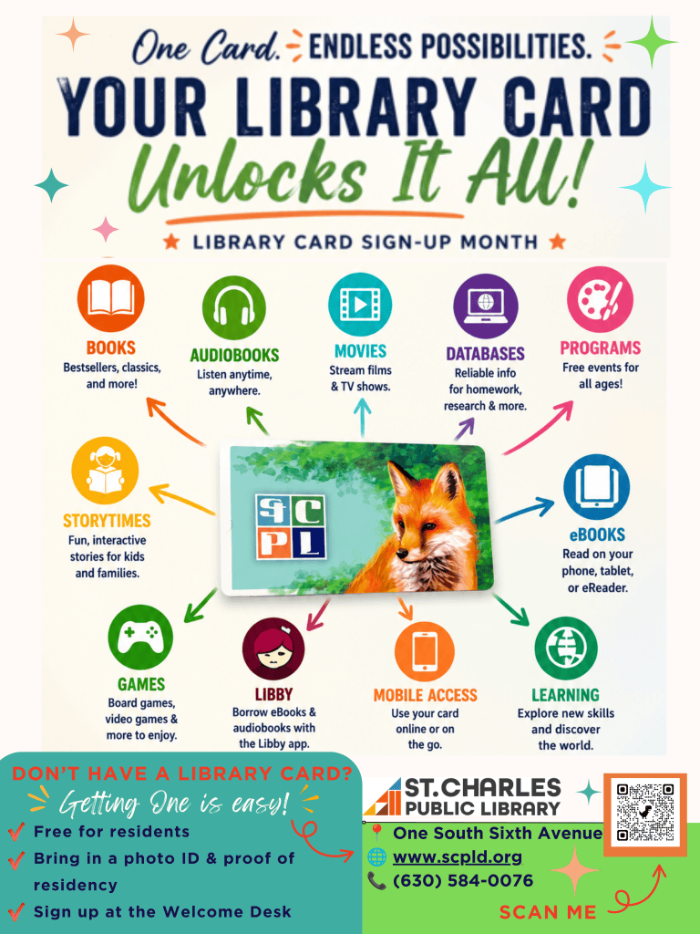
I created this flyer as a digital promotional flyer that could also be printed and displayed around the library. Since Library Card Sign-Up Month is meant to encourage people of all ages to get a library card, I wanted the design to be colorful, inviting, and easy to read. My main idea was to show that one library card unlocks many different resources and services, so I placed the library card in the center of the flyer with arrows pointing to everything patrons can access, including books, audiobooks, movies, databases, programs, Libby, and more.
While designing the flyer, I intentionally used Robin Williams’ design principles. I used contrast by creating a large, bold headline that draws attention and by using bright colors against a light background. I used repetition by sticking to the same family of teal, green, orange and blue colors and using consistent fonts and icon styles throughout the flyer. Alignment helped keep the sections organized and easy to follow, while proximity grouped related information together so patrons can quickly find what they need, such as the benefits of a library card and the steps for signing up.
I experimented with a few different layouts before settling on this one. At first, I had more text explaining each service, but it made the flyer look crowded and busy. I decided to simplify the wording and let the icons and images communicate the message. I also considered using a single color scheme or muted colors, but I felt brighter colors would better capture attention and reflect the welcoming atmosphere of the library. The brighter colors seemed more fun and inviting.
I used Canva because it offers professional templates and makes it easy to arrange images, icons, colors, and text while maintaining a balanced layout. I love using the different features in Canva and I feel like I learn something new every time I use it!
One of my favorite parts of the flyer is the “One Card Unlocks It All!” theme because it highlights that a library card provides access to much more than books. There still seems to be a stigma that libraries are quiet places where you can just check out books, that is no longer true! I wish I could have also added information about our Beyond Books and STC Creative Makerspace that only our cardholders can use…but I really did want to make a simple flyer.
If I were using this for social media, I would adapt this into a square or vertical format with less text so it is easier to read on a phone. For a printed version, I would keep the larger layout because it allows patrons to quickly scan the flyer while visiting the library. Overall, I think this flyer effectively promotes Library Card Sign-Up Month while showcasing the many resources available through St. Charles Public Library.
One response to “Post 7: Promotional Flyer”
-
Hi Kerri –
Thanks for sharing! I absolutely LOVE your flyer. It’s bright, eye-catching, accessible (with a QR code & social media links) and visually informative without overwhelming your viewers. I really enjoyed your decision to highlight the library’s features beyond the books since I always hear patrons surprised to learn what the library offers/what their library card can provide! Definitely a fun and inviting design. I love all of Canva’s features! Great job! 🙂
LikeLike


Leave a Reply